BRAND GUIDE
Identity guidelines for Bat & Barrel — a community-rooted training facility built by the community, for the community.
BRAND INTENT
What Bat & Barrel stands for
WHAT WE ARE
- ✓Community-rooted — local owners, built for Upland and surrounding communities — designed for athletes, teams, and families
- ✓Athletic — built for year-round reps, focused on development, fundamentals, and putting in real work
- ✓Modern training facility with timeless atmosphere — offering top-tier equipment all under one roof
- ✓Accessible, not exclusive — built for players of all ages and skill levels — from beginners to serious ballplayers
WHAT WE AVOID
- ✗Money-first messaging
- ✗Over-produced, slick design
- ✗Gimmicks
- ✗Exclusivity signals — this isn't a private club
"If it looks like it came from a franchise playbook, it's wrong."
COLOR PALETTE
Eight colors, their roles, and how to use them
#1a1a1a
#252525
#787878
#843127
#d4c4a8
#e8dcc8
#faf7f2
#5c4033
COLOR ROLE
DARK FOUNDATION
Primary Dark, Secondary Dark, Faded
WHAT THEY ARE
The structural backbone of the brand. Three values of dark that create depth and hierarchy without introducing color.
HOW TO USE
- Primary Dark#1a1a1a
Page backgrounds, hero sections, primary text on light surfaces. The default "black." - Secondary Dark#252525
Cards, panels, and secondary surfaces layered on top of Primary Dark. Creates subtle depth without visible borders. - Faded#787878
Captions, secondary text, timestamps, muted UI elements. Never for headings or primary content.
PROPORTION
These darks should dominate — roughly 50–60% of any dark-themed layout.
COLOR ROLE
BRAND ACCENT
Logo Red
ACCENT IN CONTEXT
WHAT IT IS
The single accent color in the palette. A deep, warm red pulled from the logo. Not fire-engine red — it has brown undertones that tie it to the warm neutrals.
HOW TO USE
- •Logo and mark elements
- •Bullet points, list markers, small accent details
- •Calls to action (buttons, links)
- •Section dividers and emphasis moments
HOW NOT TO USE
- ✗Never as a background for large areas
- ✗Never as body text
- ✗Never paired with other reds or bright colors
PROPORTION
Used sparingly — roughly 5–10% of any layout. It's the punctuation, not the sentence.
COLOR ROLE
WARM NEUTRALS
Infield Tan, Infield Light, Cream, Leather
WHAT THEY ARE
The warmth of the palette. Named for the materials and surfaces of baseball: infield dirt, leather gloves, dugout benches. These prevent the brand from feeling cold or corporate.
HOW TO USE
- Cream#faf7f2
Primary light background. The default "white" — never use pure white. - Infield Light#e8dcc8
Callout cards, highlighted sections, subtle surface changes on light layouts. - Infield Tan#d4c4a8
Secondary text on dark backgrounds, supporting details, label text. - Leather#5c4033
Body text on light backgrounds, headings on cream, rich warm accent that anchors the warm neutrals.
PROPORTION
These fill the remaining 30–40% of layouts, providing warmth between the darks and the accent red.
PAIRING QUICK REFERENCE
DARK LAYOUTS
- •Primary Dark background
- •Secondary Dark cards and panels
- •Faded for captions and secondary text
- •Infield Tan for primary text
- •Logo Red for accents
LIGHT LAYOUTS
- •Cream background
- •Infield Light for cards and callouts
- •Leather for body text
- •Primary Dark for headings
- •Logo Red for accents
Never use pure white (#fff) or pure black (#000) as surface colors. The palette is intentionally warm.
TYPOGRAPHY
Font families and their applications
Display Font
BEBAS NEUE
Headlines, signage, hero text
ABCDEFGHIJKLMNOPQRSTUVWXYZ
0123456789
Rules: Always uppercase, letter-spacing 0.05em+
Script Font
Pacifico
Taglines, signatures, playful moments
abcdefghijklmnopqrstuvwxyz
0123456789
Rules: Use sparingly — one instance per surface max
Body Font
Inter
Body copy, UI, captions
ABCDEFGHIJKLMNOPQRSTUVWXYZabcdefghijklmnopqrstuvwxyz
0123456789
Rules: Neutral workhorse — never competes with display type
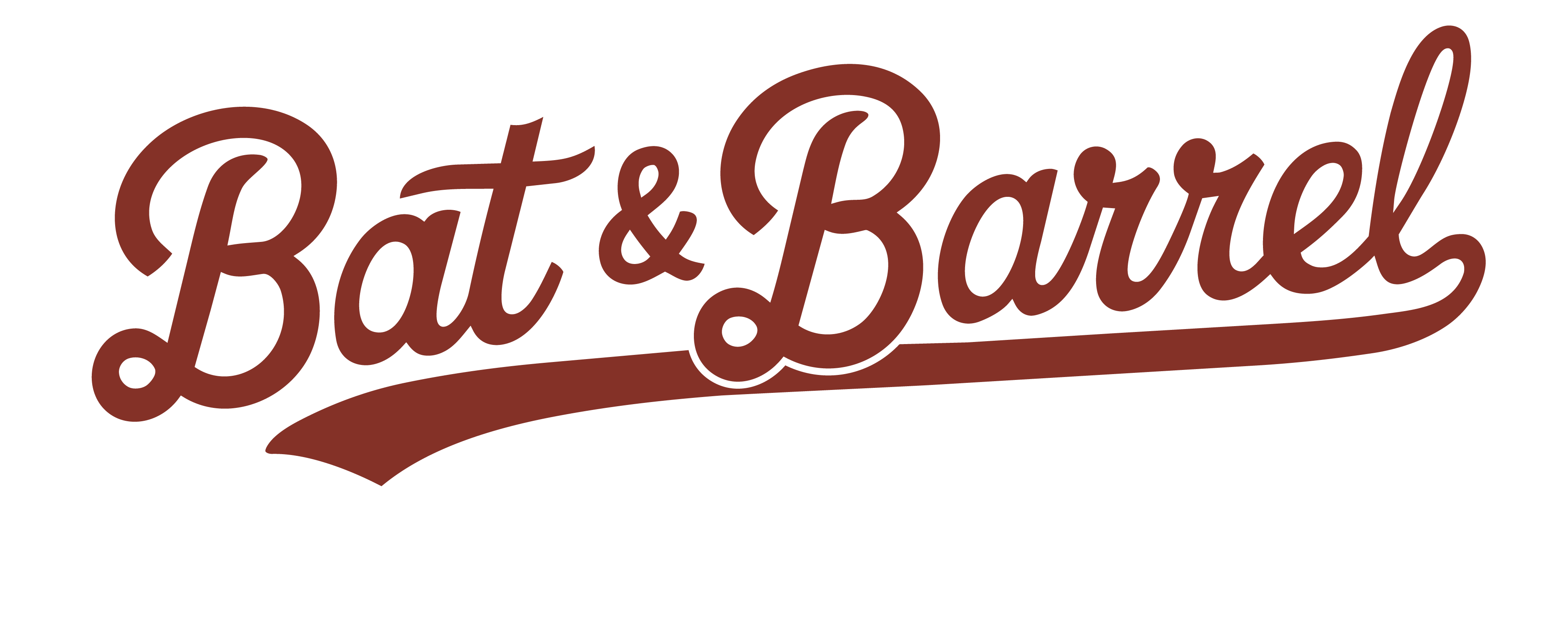
LOGO SYSTEM
Logo variants, usage rules, and application guidance
THE ONE RULE
The background of the logo must match the background it sits on. No exceptions. Every logo variant below includes specific guidance on which backgrounds it belongs on. If you remember nothing else from this guide, remember this.
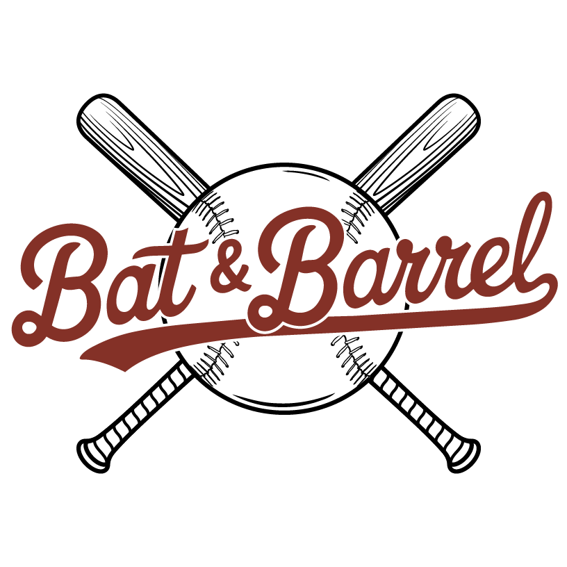
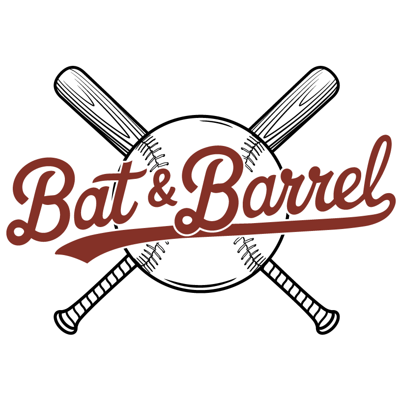
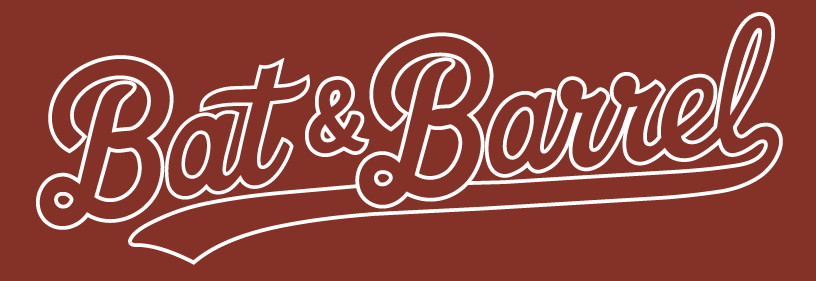
PRIMARY LOGO
FULL LOGO
The complete Bat & Barrel mark
ON DARK BACKGROUNDS
ON LIGHT BACKGROUNDS
WHAT IT IS
The full Bat & Barrel mark — baseball, crossed bats, and script wordmark. This is the primary identity and should be the first choice whenever space and context allow.
WHEN TO USE
- •Facility signage and entrance
- •Website headers and hero sections
- •Large-format print (posters, banners, wall graphics)
- •Anywhere the brand is being introduced for the first time
BACKGROUND RULES
Use the white variant on dark backgrounds (black, leather, dark photography). Use the dark variant on light backgrounds (cream, white, infield tan). Never place this logo on a red background.
MINIMUM SIZE
120px wide on screen. 1.5" wide in print. The crossed bats and stitching detail degrade at smaller sizes — switch to the Wordmark or Stencil below that threshold.
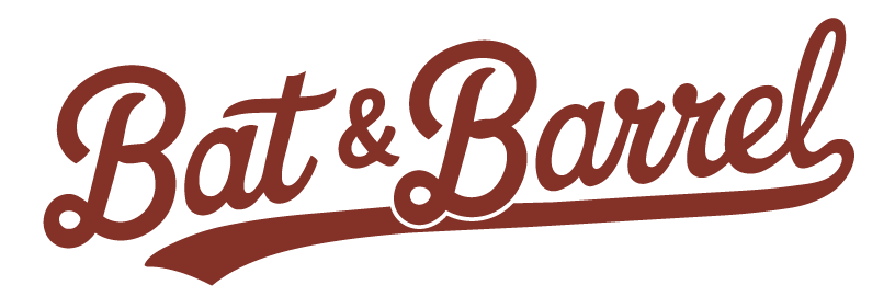
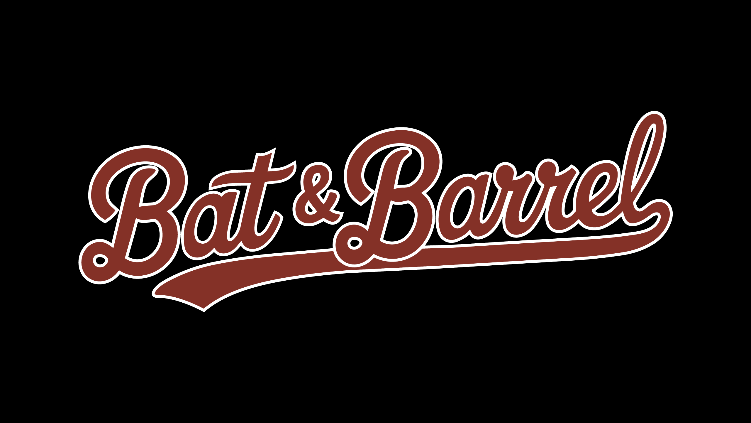
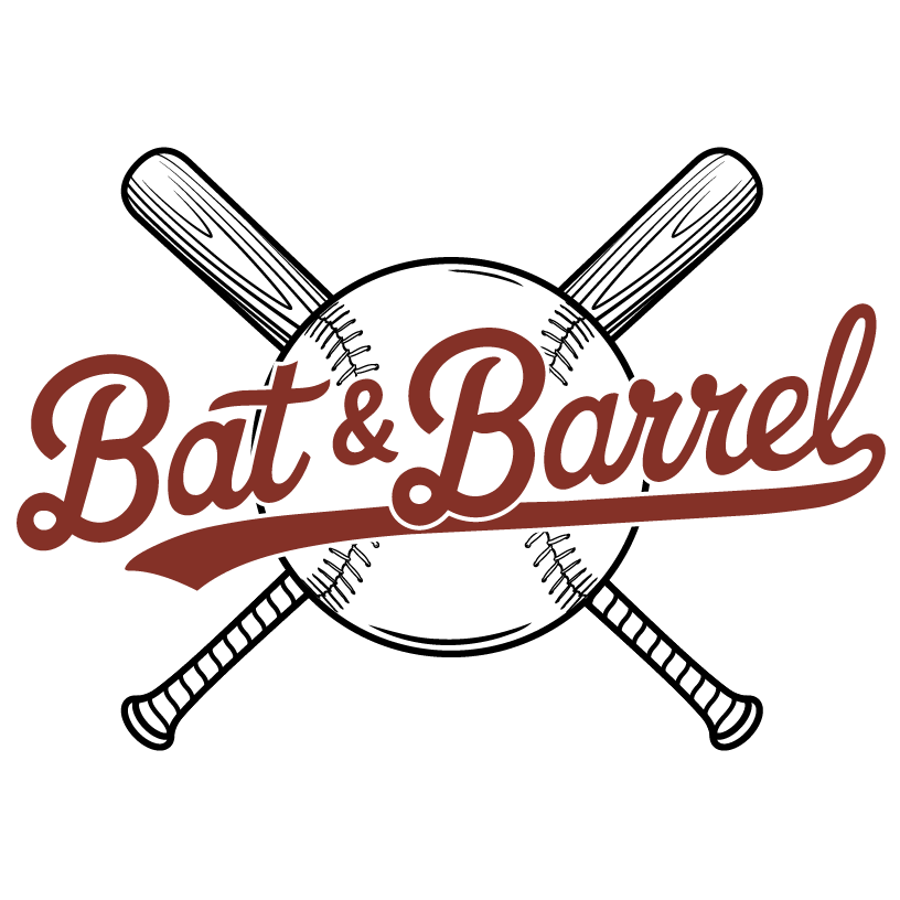
BRAND LOGO
WORDMARK
The text-only mark
ON DARK BACKGROUNDS
SELF-CONTAINED BLACK LOCKUP
SELF-CONTAINED RED LOCKUP
WHAT IT IS
The "Bat & Barrel" script wordmark without the baseball or bats. A streamlined alternative that carries the brand voice through its hand-lettered character.
WHEN TO USE
- •Apparel and embroidery
- •Social media profiles and cover images
- •Medium-format applications where the full mark is too detailed
- •Repeat touchpoints where brand recognition is established
BACKGROUND RULES
The transparent wordmark works on dark backgrounds. For other contexts, use one of the self-contained lockups. The black lockup places the wordmark on a built-in black background for guaranteed consistency. The red lockup is the only logo variant approved for a red background — use it for accent moments where brand energy is needed.
MINIMUM SIZE
100px wide on screen. 1" wide in print. The script remains legible at smaller sizes than the full logo.
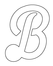
LOGO MARK
STENCIL
The compact brand mark
ON DARK BACKGROUNDS
ON LIGHT BACKGROUNDS
WHAT IT IS
A stylized script "B" derived from the wordmark. The simplest expression of the Bat & Barrel identity — a single letterform that works at any size.
WHEN TO USE
- •Favicons and browser tabs
- •App icons and social media avatars
- •Watermarks
- •Embossed or debossed applications (leather, metal, fabric)
BACKGROUND RULES
The stencil is a single-color outline mark. On dark backgrounds, the white fill reads clearly. On light backgrounds, the black outline carries the shape. Avoid placing on busy photography without a solid background behind it.
MINIMUM SIZE
24px — this is the go-to mark at micro scale.
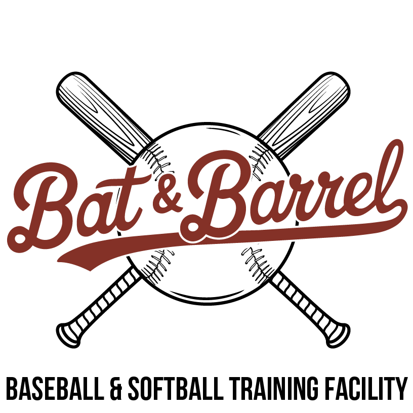
TRAINING SUB-BRAND
The following variants include the "Baseball & Softball Training Facility" descriptor. Use these when the context requires clarifying what Bat & Barrel is — particularly for audiences encountering the brand for the first time.
TRAINING VARIANT
FULL TRAINING LOGO
Primary mark with facility descriptor
ON DARK BACKGROUNDS
ON LIGHT BACKGROUNDS
WHAT IT IS
The full Bat & Barrel mark with "Baseball & Softball Training Facility" set beneath it. This variant communicates both the brand identity and the nature of the business in a single lockup.
WHEN TO USE
- •First-impression contexts: trade shows, sponsorship banners, directory listings
- •Print advertising where the audience may not know the brand
- •Facility exterior signage
- •Letterhead and official documents
BACKGROUND RULES
Use the white-text variant on dark backgrounds. Use the dark-text variant on light backgrounds. The background must be a solid, exact color match. Do not float on photography or gradients.
MINIMUM SIZE
200px wide on screen. 2.5" wide in print. The descriptor text must remain legible.
TRAINING VARIANT
TRAINING WORDMARK
Wide-format training mark
ON LIGHT BACKGROUNDS
WHAT IT IS
A wide-format rendering of the "Bat & Barrel" script wordmark optimized for horizontal applications. This is a sub-brand variant intended for training-specific materials.
WHEN TO USE
- •Banners and fence signs at the facility
- •Training program print materials and handouts
- •Wide-format digital ads (leaderboard, banner)
- •Uniform or apparel applications where horizontal space is available
BACKGROUND RULES
This variant is provided in dark colorway only. Place exclusively on light backgrounds (cream, white, infield tan). Do not attempt to invert or recolor.
MINIMUM SIZE
250px wide on screen. 3" wide in print. The wide aspect ratio requires generous horizontal space.
DOWNLOADS
BACKGROUND QUICK REFERENCE
DARK BACKGROUNDS
- •Full Logo (white)
- •Wordmark (white)
- •Stencil
- •Full Training Logo (white text)
LIGHT BACKGROUNDS
- •Full Logo (dark)
- •Stencil
- •Training Wordmark
- •Full Training Logo (dark text)
RED BACKGROUND
- •Wordmark (red lockup) only
No other logo variant is approved for red backgrounds.
SURFACE SYSTEM
The 3-layer model determines how much branding is applied
PRIMARY
"Establish Identity"
- Facility interior
- Website landing
- Core signage
- Staff apparel
- Business cards
SECONDARY
"Signal Identity"
- Flyers & banners
- Event signage
- Email signatures
- Social posts
ENVIRONMENTAL
"Create Atmosphere"
- Photography
- Social imagery
- Background textures
- Invoices & receipts
IMAGERY & TEXTURE
Photography direction and visual treatment
USE
- ✓Real environments — facility, field, equipment
- ✓Athletic context — action, training, gameplay
- ✓Grit, texture, light wear for authenticity
- ✓Warm color grading aligned with palette
AVOID
- ✗Stock imagery that feels staged
- ✗Overly polished/glossy visuals
- ✗Trend-based filters
- ✗Generic sports clichés
WHAT "VINTAGE" MEANS
Familiar
Feels like something you've known
Proven
Established, trusted
Timeless
Won't date itself
Comfortable
Approachable, not precious